From Parts Unknown FP U
An art and design practice founded by Steven Waring. Part of ENSEMBLE, a brand and strategy studio.


- All
- Identity
- Design / Art Direction
- Image Making
- Digital
Various Logotypes
2010—2017
- All
- Identity
- Design / Art Direction
- Image Making
- Digital
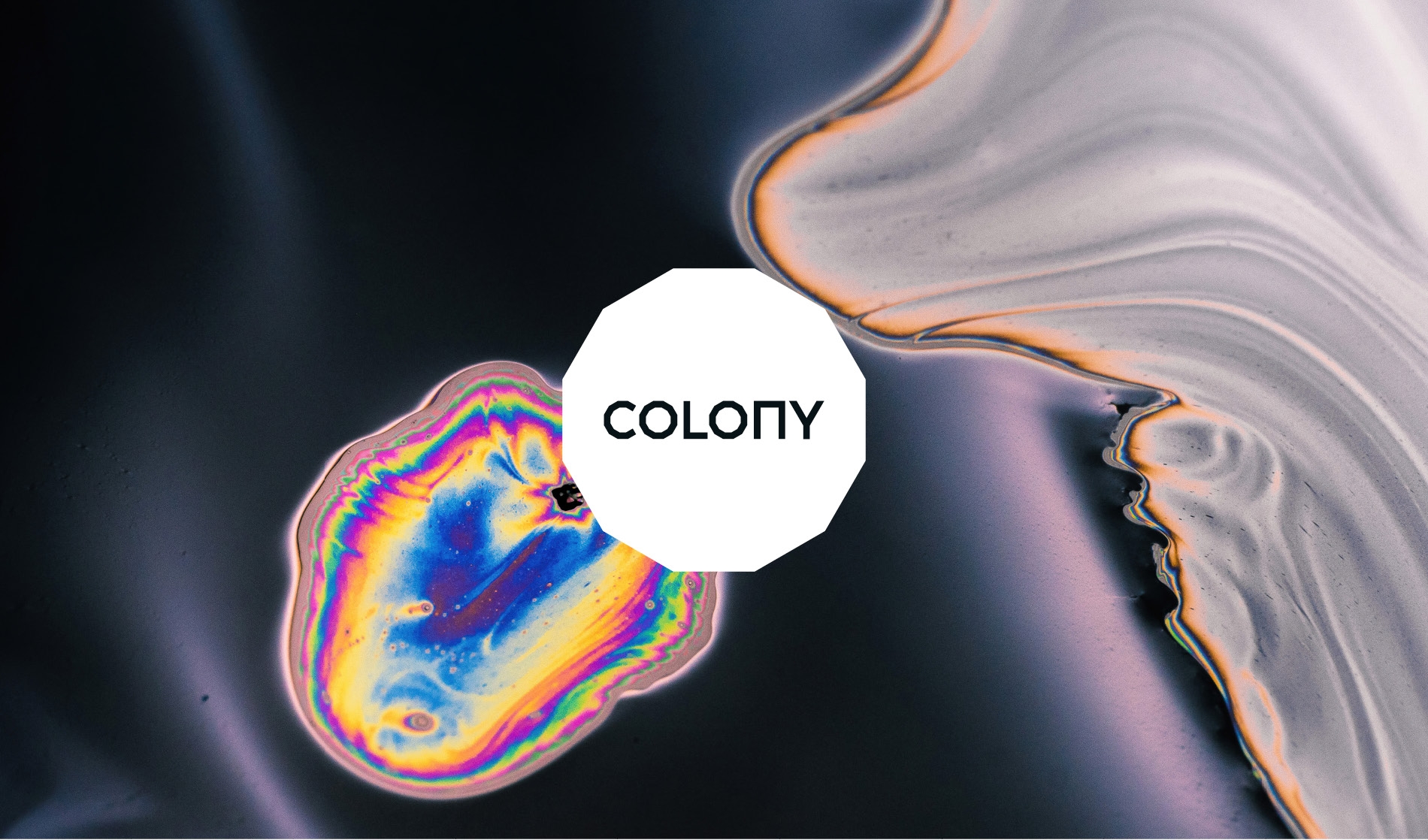
Colony
Brand identity
- All
- Identity
- Design / Art Direction
- Image Making
- Digital
AMP
Brand identity
- All
- Identity
- Design / Art Direction
- Image Making
- Digital
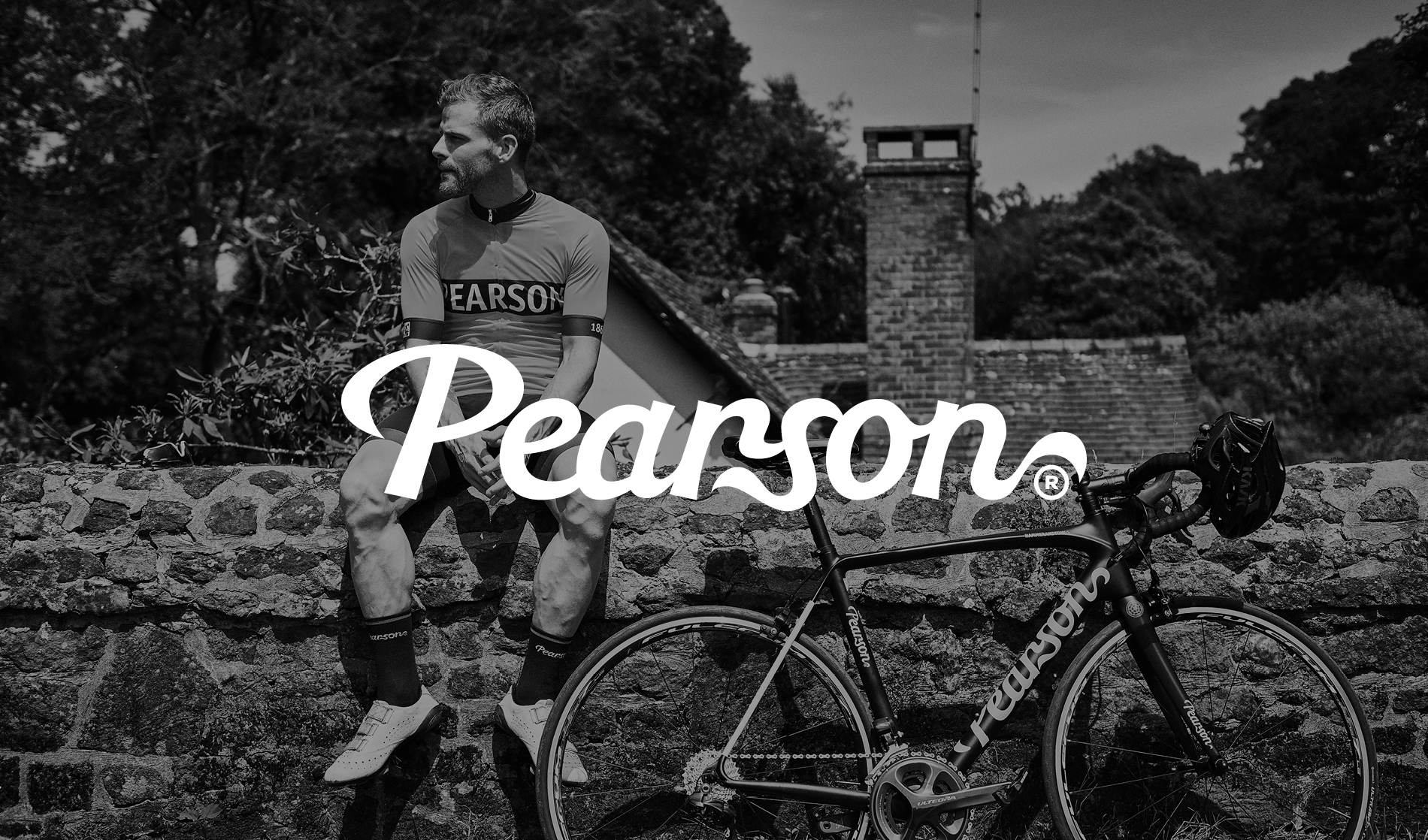
Pearson Cycles
Brand identity system for Pearson Cycles, with a view to moving into producing apparel as well as kit. As the oldest bike shop in the UK, they have more heritage and therefore more reason than any other to exist in this space, so we developed a brand that referenced and celebrated their heritage with a contemporary edge.
- All
- Identity
- Design / Art Direction
- Image Making
- Digital
InVision
Brand identity
- All
- Identity
- Design / Art Direction
- Image Making
- Digital
Pearson Cycles
- All
- Identity
- Design / Art Direction
- Image Making
- Digital
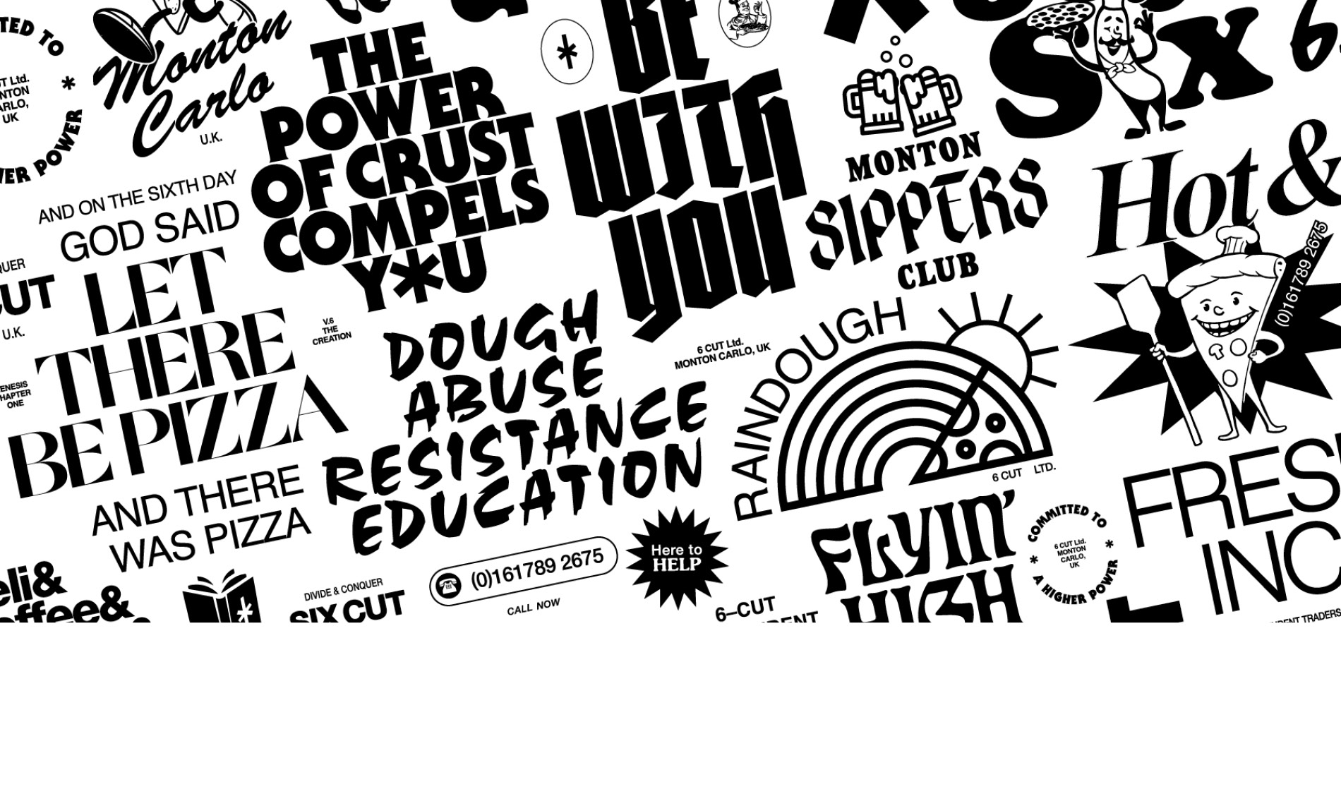
6/Cut
Identity
- All
- Identity
- Design / Art Direction
- Image Making
- Digital
Kinetic
Kinetic is a student development in Old Trafford, surrounded by sporting heritage and the new U92 Academy. The name looked at reflecting this, with the visual cues taken from typography in sport, creating an interlocking fabric for flexible application.
- All
- Identity
- Design / Art Direction
- Image Making
- Digital
The Leat
An identity for student housing in Exeter, built by Roach + Partners. With unexpected levels of finish paired with a quirky edge, the visual system looked at reflecting this though flexible interlocking graphics, a bespoke typeface (created specifically for use on way finding and signage), plus a diamond graphic device (informed by the entrance gate, created by a local Exeter artist).
Initial promotional work (used to generate interest) was bright, bold and contemporary. This slowly gives way to a more toned down aesthetic when on site, allowing for materials such as brass, steel and corten within the wayfinding to drive the feeling of quality and detailing.
- All
- Identity
- Design / Art Direction
- Image Making
- Digital
Deansgate Mews Festival
- All
- Identity
- Design / Art Direction
- Image Making
- Digital
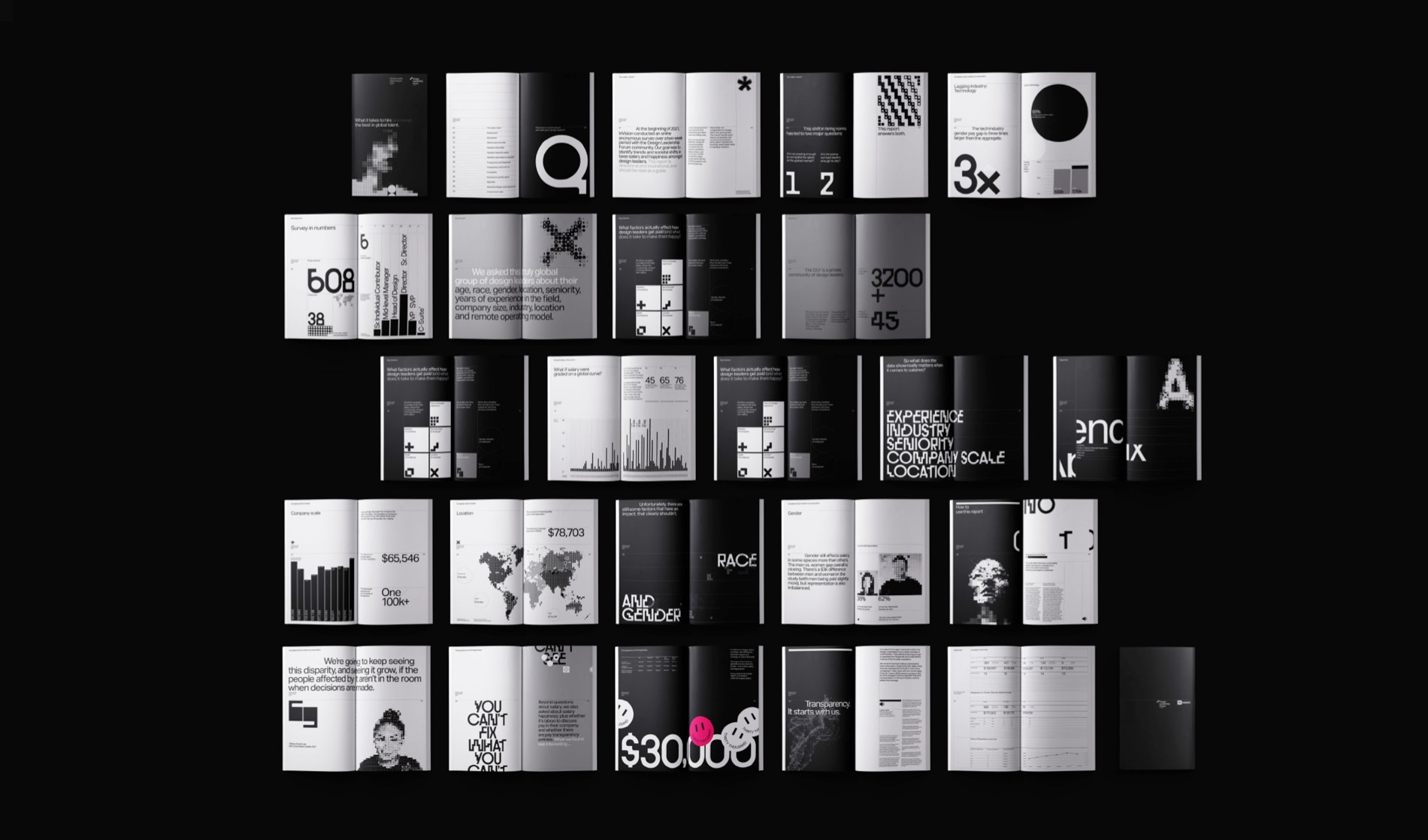
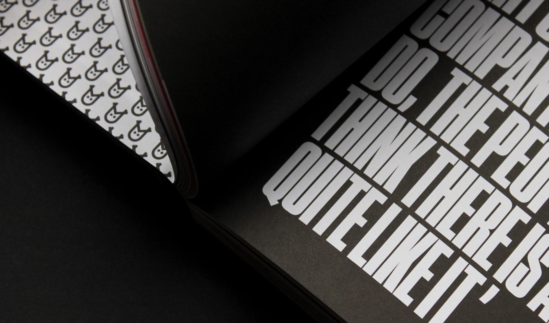
The Design Leadership Forum
Editorial
- All
- Identity
- Design / Art Direction
- Image Making
- Digital
Fourways
Identity & Campaign
- All
- Identity
- Design / Art Direction
- Image Making
- Digital
Burrindi
- All
- Identity
- Design / Art Direction
- Image Making
- Digital
Liberating Research
An extensive programme of design across digital and print for an online medical survey startup.
- All
- Identity
- Design / Art Direction
- Image Making
- Digital
Deloitte
- All
- Identity
- Design / Art Direction
- Image Making
- Digital
Deloitte
- All
- Identity
- Design / Art Direction
- Image Making
- Digital
Shillington Education
- All
- Identity
- Design / Art Direction
- Image Making
- Digital
Executive Nexus
Brand Identity
- All
- Identity
- Design / Art Direction
- Image Making
- Digital
Colony
Wayfinding System
- All
- Identity
- Design / Art Direction
- Image Making
- Digital
Sugar Skulls
- All
- Identity
- Design / Art Direction
- Image Making
- Digital
Lynx Academy
- All
- Identity
- Design / Art Direction
- Image Making
- Digital
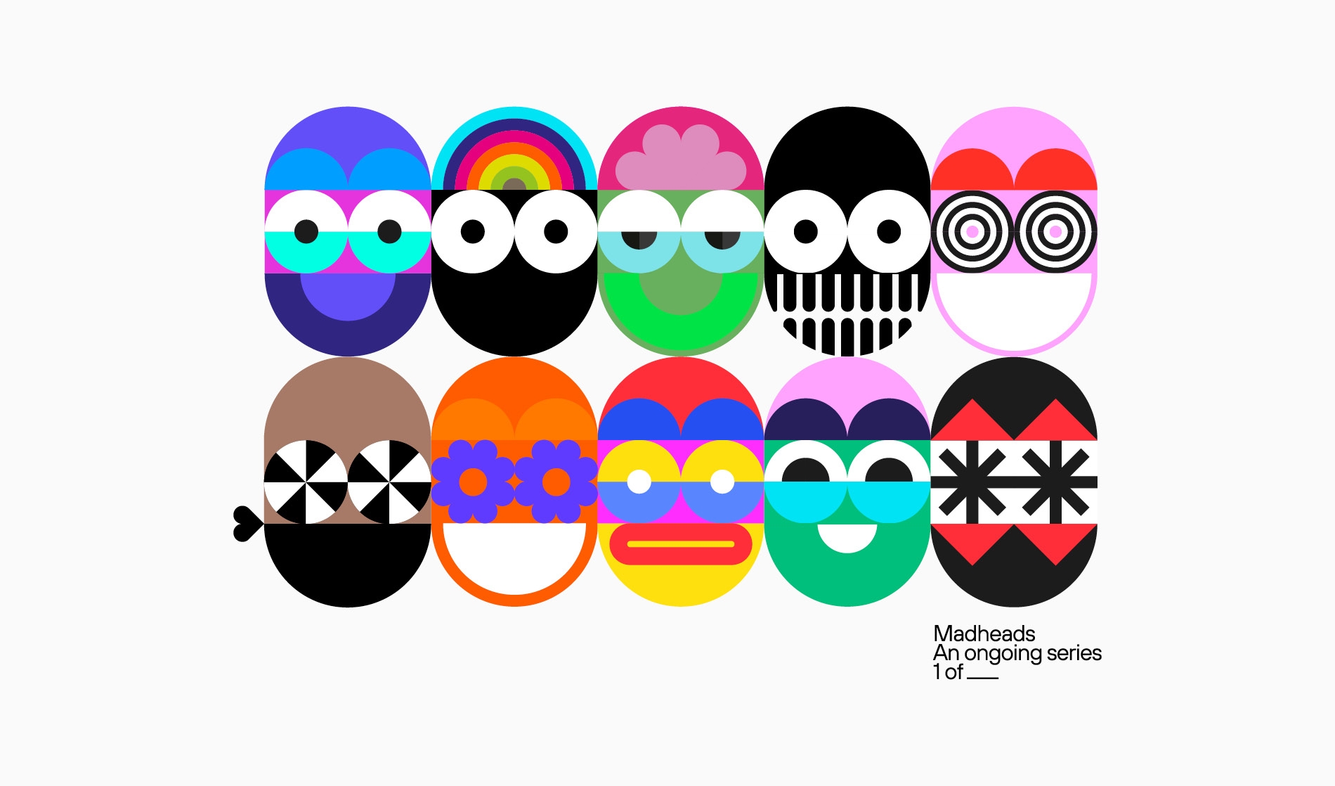
Madheads
- All
- Identity
- Design / Art Direction
- Image Making
- Digital
Colony
Environmental
- All
- Identity
- Design / Art Direction
- Image Making
- Digital
Lynx PRIDE
- All
- Identity
- Design / Art Direction
- Image Making
- Digital
Bad Lieutenant
- All
- Identity
- Design / Art Direction
- Image Making
- Digital
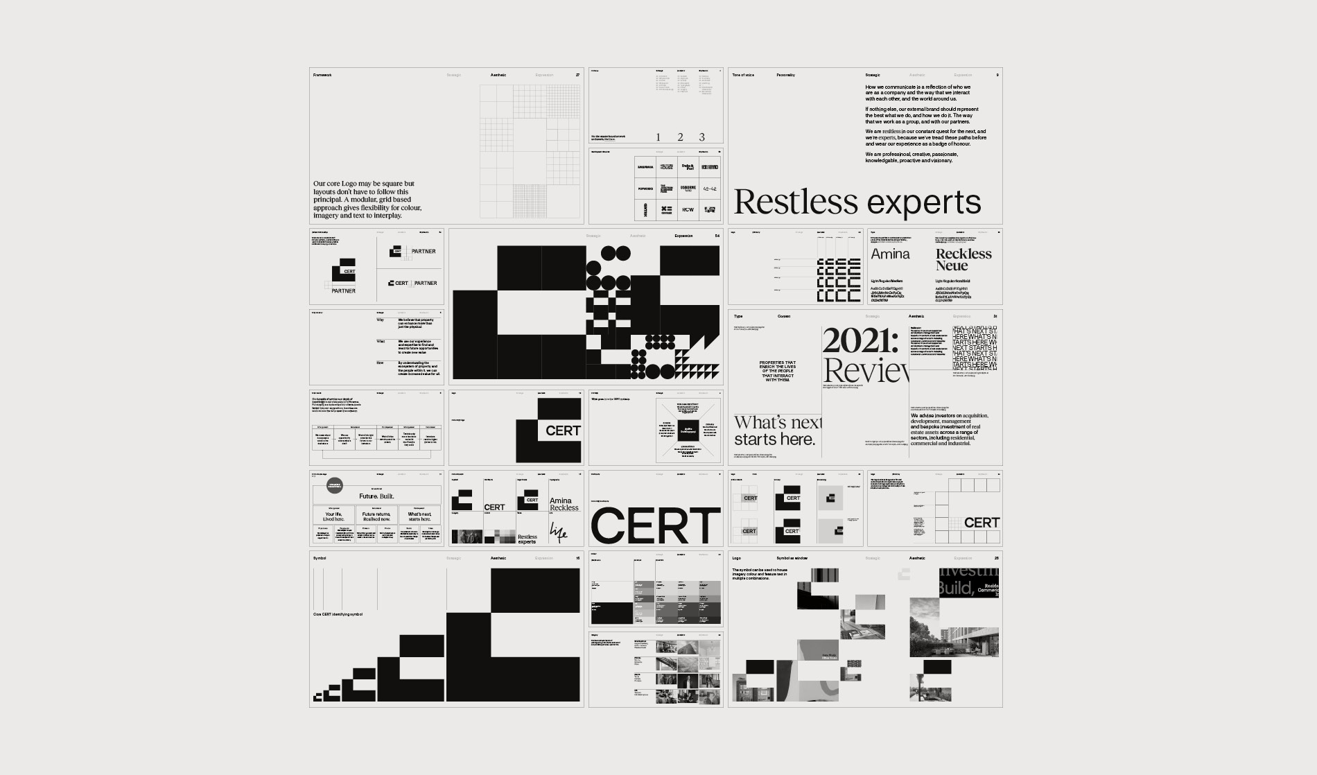
Cert Property
Identity
- All
- Identity
- Design / Art Direction
- Image Making
- Digital
Food at Manchester Central
- All
- Identity
- Design / Art Direction
- Image Making
- Digital
Tombstone Blues
Type Design
- All
- Identity
- Design / Art Direction
- Image Making
- Digital
Food at Manchester Central
- All
- Identity
- Design / Art Direction
- Image Making
- Digital
Nona Type Family
- All
- Identity
- Design / Art Direction
- Image Making
- Digital
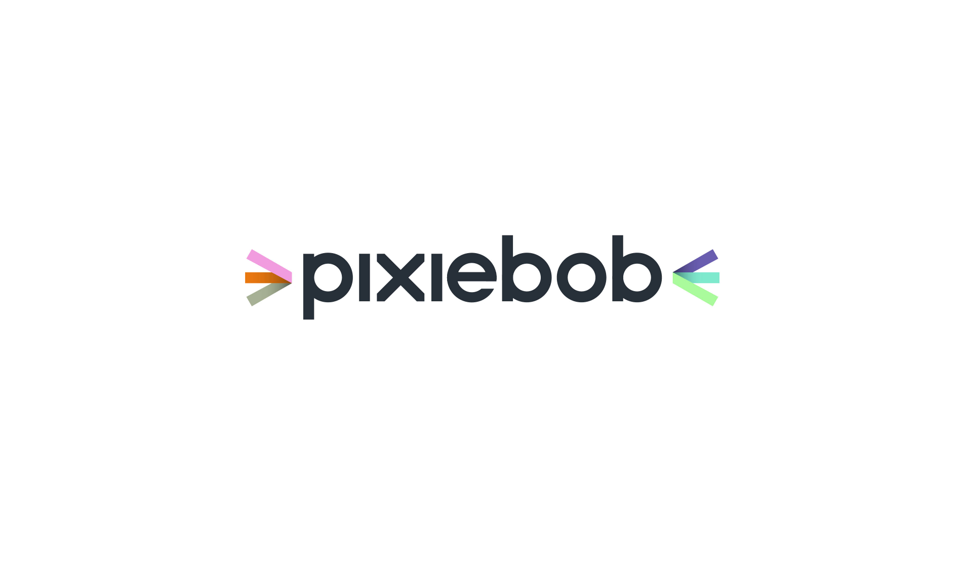
Pixiebob
Brand positioning of Pixiebob, a new community insights platform. The name was infromed by the inquisitive nature of cats (with an intentional nod of personality and quirk) – a thread that also runs through the visual aesthetic from the literal illustrations, often showing a cat exploring within space – though to the core logo and signifier.
The logotype itself comprises of a bespoke wordmark (with a shorthand identifier also developed), accompanied by colourful ‘whiskers’, both a reference to the cat itself, but also hinting at a spark of energy in the sharing of information and knowledge. The ‘whiskers’ are accompanied by a secondary set of graphics or ‘tails’ – seen as the connection point between the visual elements.
- All
- Identity
- Design / Art Direction
- Image Making
- Digital
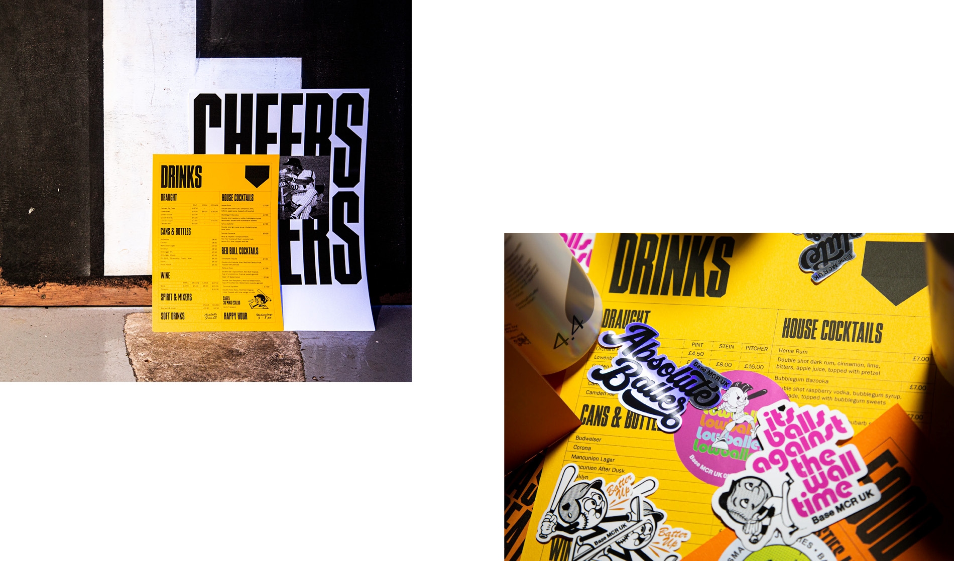
Base Bar
Identity
- All
- Identity
- Design / Art Direction
- Image Making
- Digital
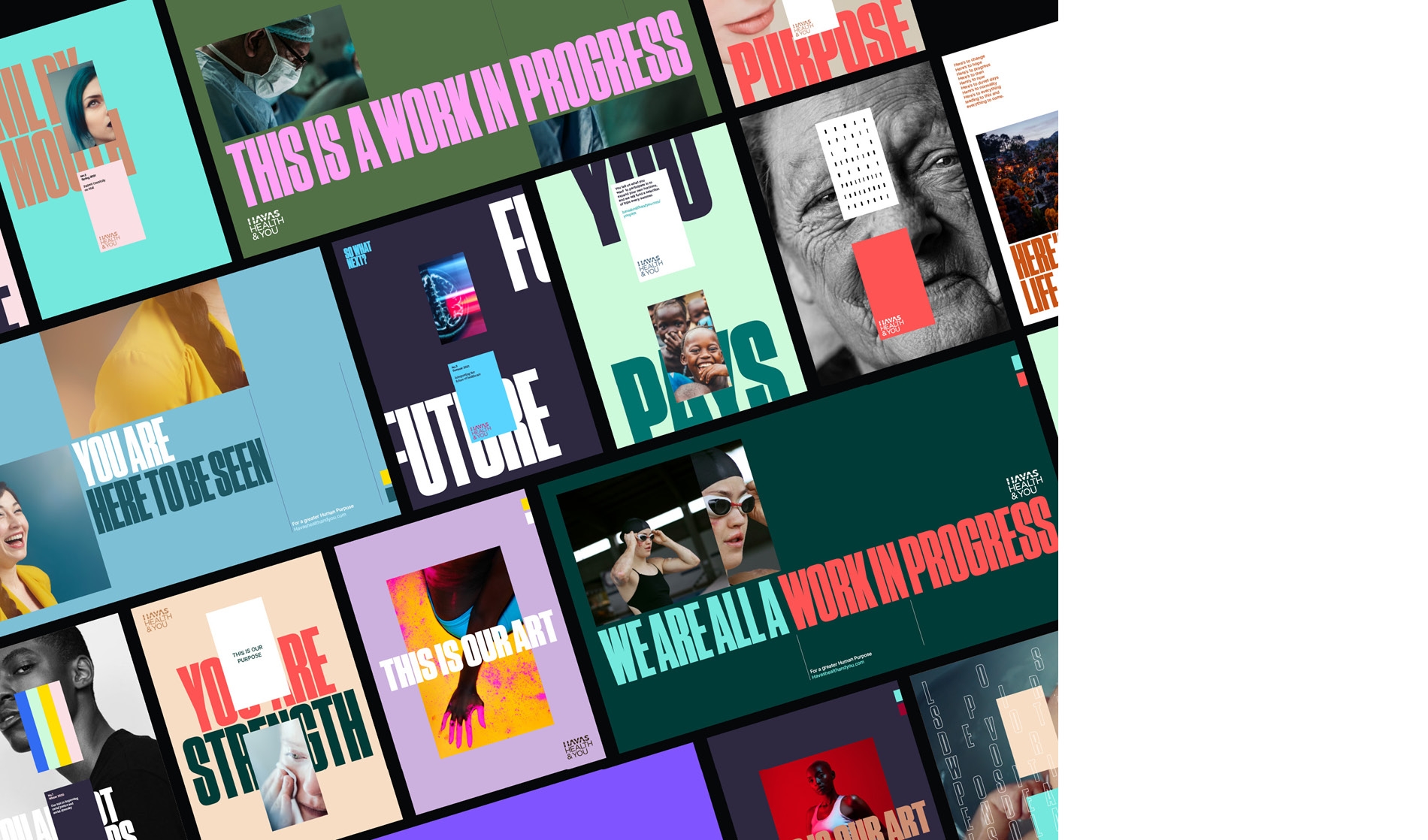
Havas Health & You
Brand Identity
- All
- Identity
- Design / Art Direction
- Image Making
- Digital
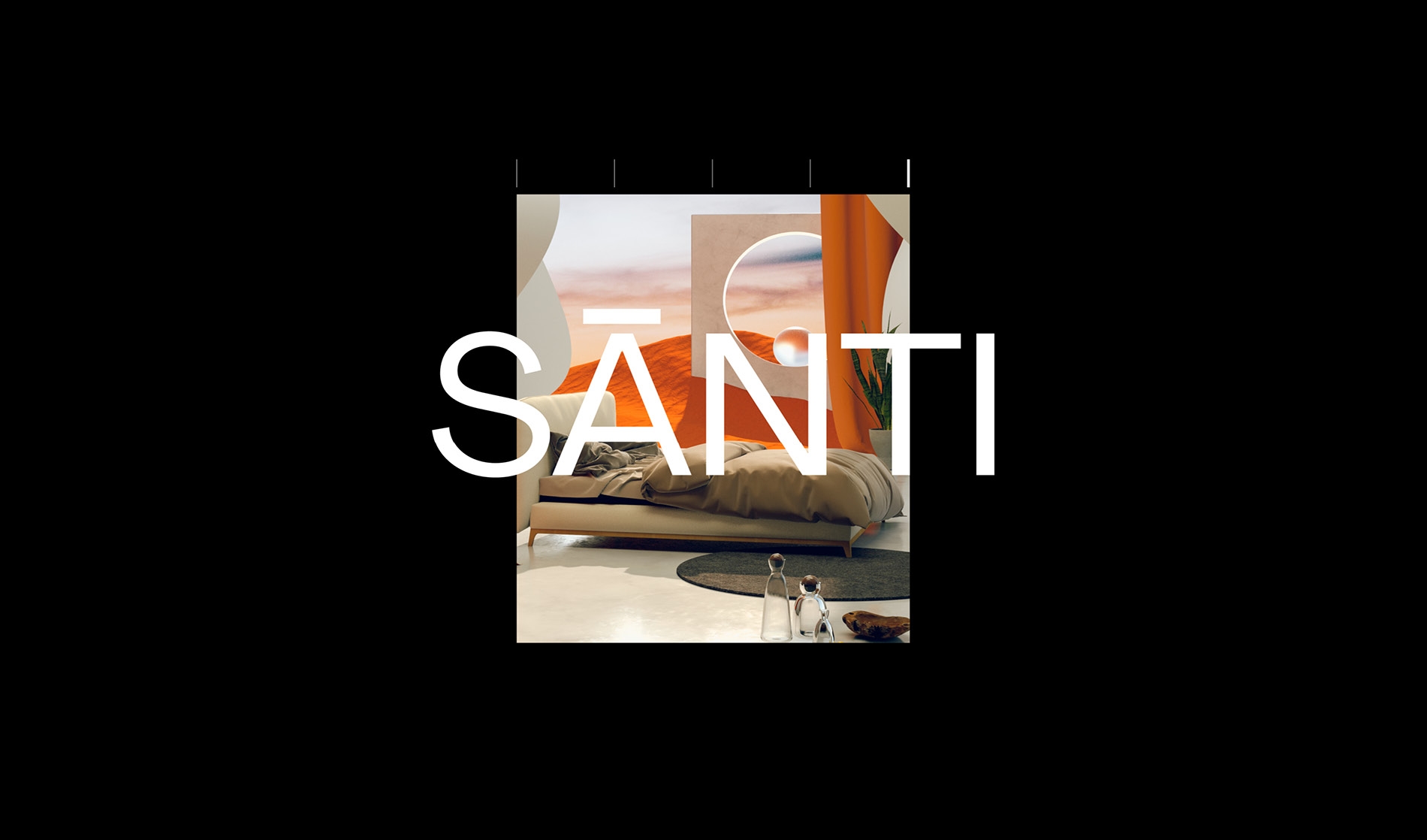
Sleep, By Santi
Identity and Packaging
- All
- Identity
- Design / Art Direction
- Image Making
- Digital
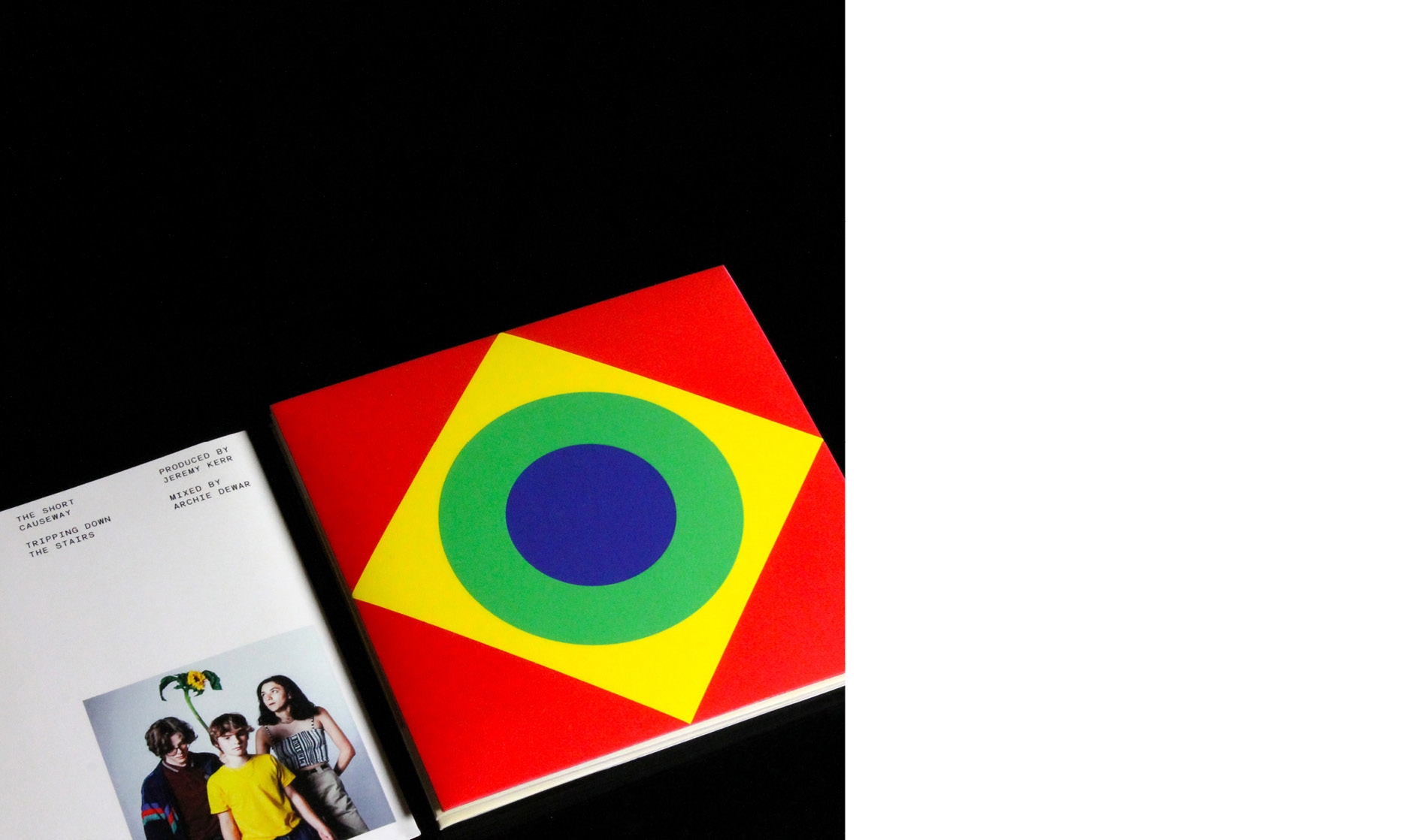
The Short Causeway
Sleeve Design